Although most businesses are concentrating their marketing efforts online, offline marketing is still extremely important. Signs remain among the most effective offline marketing methods. However, this is only right if you design your sign right. If you need a custom sign, you should be careful to avoid design fails that are likely to affect the effectiveness of the sign. What are the commonest design mistakes to avoid?
Spacing
This is among the things that you should give importance to. The letters on your sign will look awkward if you run out of space toward the end because you will have to cram them together to fit. While a sign ought to draw the attention of prospective clients, it should not attract them for the wrong reasons. While you can always redo a sign by refinishing and rewriting it, this will not be possible if you need a laser-engraved sign. To achieve a faultless laser-engraved sign, you have to confirm the accuracy of your patterns before the engraving process begins. It pays to work with a specialist in custom metal signs in Utah.
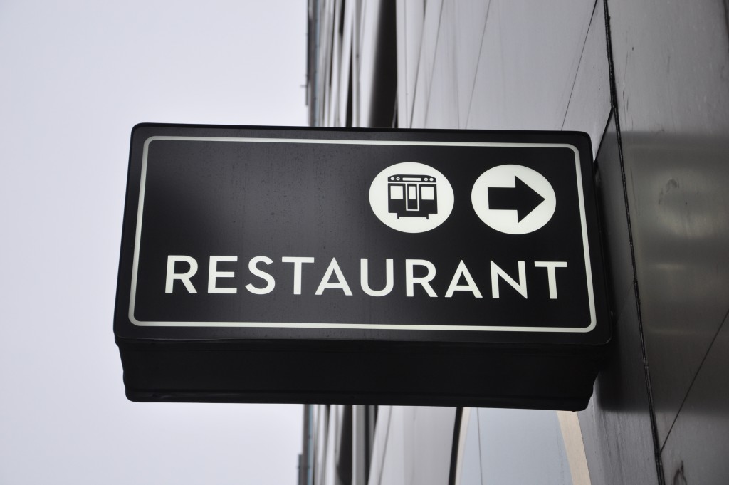
Font
Fancy fonts will not necessarily make your sign stand out. They usually affect legibility. You should invest in a sign that can be read at a glance, especially if you are to install it along a busy street. While it is important to be playful, you should not overdo it with fonts. You should also not assume that you need a fancy font simply because you sell fancy things. If a logo is necessary, be careful to keep it simple. If your logo is what identifies your business, it must be decipherable.
Contrast
Getting spacing and font right will not mean much if the contrast is wrong. Be careful to get the colours right. For instance, all the lettering on the sign should contrast with the surface. Whatever you do, do not choose colours that would be an eyesore. You simply need a letter finish that will stand out against all colours in the background. Researching about contrasting and complementary colours before writing your sign is important.
Improper Installation
Upside-down letters will give you the wrong kind of publicity. While most people may find it hard pointing out mistakes with some letters, there are some such as “U,” “Y,” and “K” that you must not make mistakes with. It pays to print a paper template of the specific letters that you will be using to avoid embarrassing gaffes.
Wrong Designer

Few service providers can actualise your vision regarding the design of your sign. This makes it important to hire the right expert. If you need a laser-engraved sign, choose a service provider that can provide precise laser cutting. This ensures decipherable signs on different types of metal.
Understand that getting the design right is not enough if you do not locate your sign well. Your sign should be visible round the clock. If there are trees in front of your business, be careful when installing your sign in winter. They will most likely block your sign when they become leafy in spring or summer.